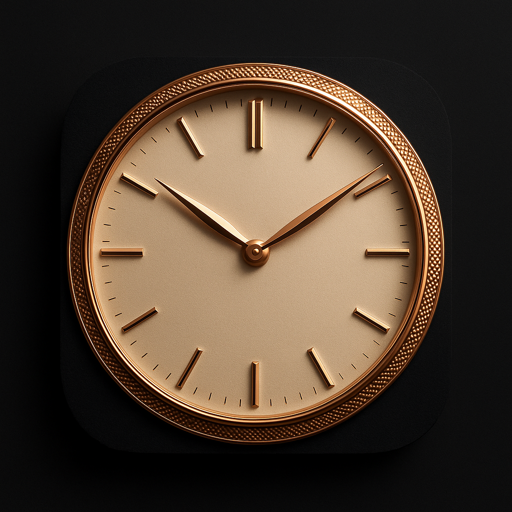
I spent a while drawing four watch dials in code — a dress watch, a diver, a pilot's watch, a GMT — and they were all correct and all wrong.
Every element was in the right place. The bezel was the right width, the markers sat at the right radius, the hands were the right shapes. And they looked like drawings of watches, which is not the same thing as looking like watches.
The reason turned out to be simple enough to state in one sentence: every ring had its own gradient, and no two of them agreed about where the light was. The bezel was shaded top-left. The markers had a left-to-right gradient because that looked good in isolation. The centre cap had a radial highlight pointing somewhere else again. Each piece had been drawn to look good on its own, and the result was a collage — a set of objects that had never been in the same room.
So I stopped drawing and started measuring.
Measuring instead of guessing
I put together reference photographs of watches framed the way the widget frames them — the head from directly above, no strap, no crown, filling the frame, on a dark ground — and wrote a small tool that walked outward from the centre and took the median brightness of every radius ring, separately for the arc facing the light and the arc opposite it.
Four things came back, and each one changed the code.
Luminous material does not glow in daylight. This was the big one. In every photograph the lume is a pale cream ceramic with barely a hint of colour. The saturated green everyone pictures is what it emits in the dark — it is not the colour of the material, it is the colour of the light the material gives off later. I had been painting it in its night colour, and that single mistake was what most loudly announced that the dial had been drawn. Now the marker is drawn in a day fill mixed most of the way toward cream, and the saturated tone appears only in the glow.
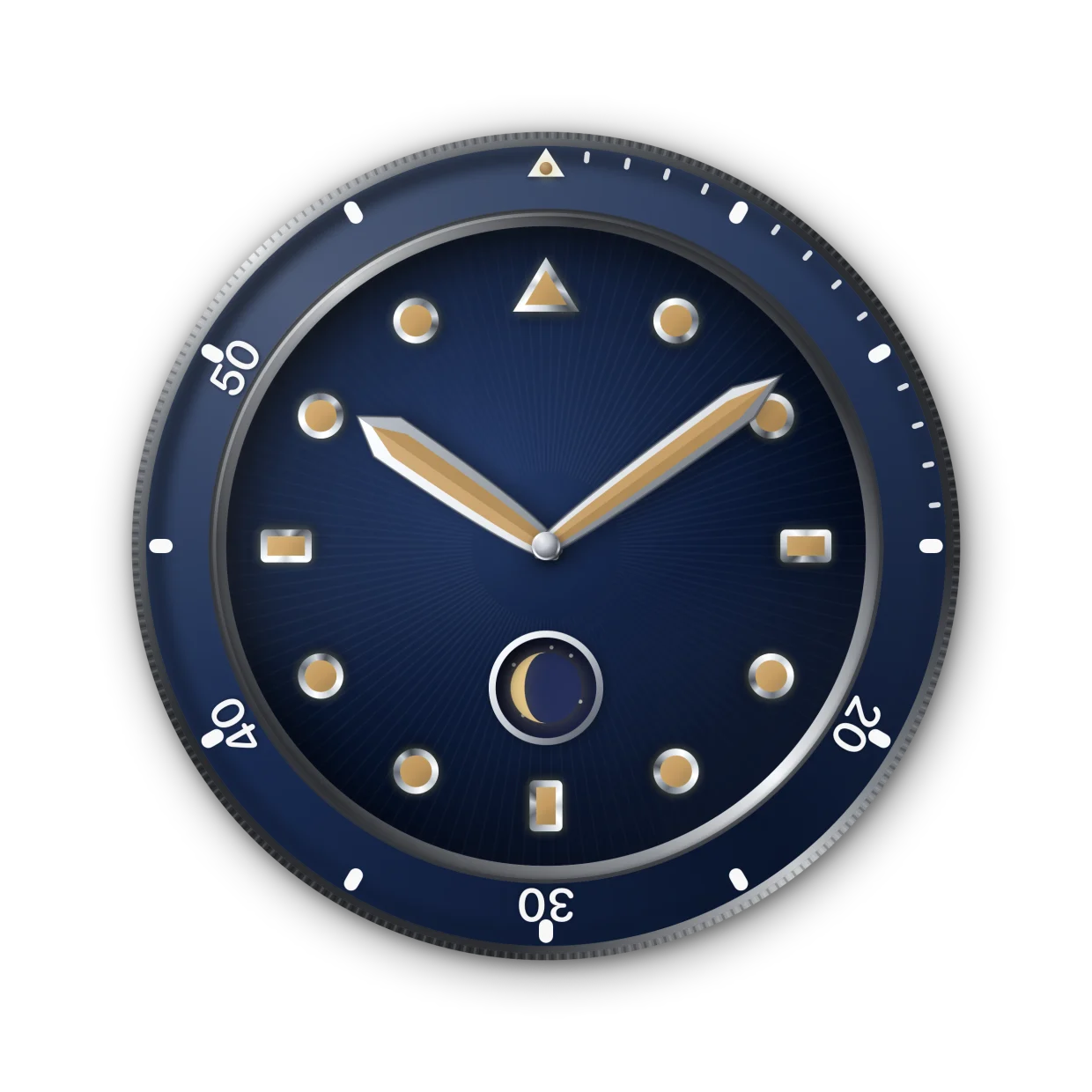
The green is what it would emit in the dark.
A bright metal ring is a ring with one narrow bright arc. The polished flange — the mirrored ring between the bezel and the dial — reads as brilliant, so I had been drawing it bright. The measurement said it is almost entirely dark: on a scale where 255 is white, its median is 23, and only a small, fierce highlight reaches 177. Brightening it uniformly produces exactly the same median and looks like grey plastic, because what the eye reads as polish is not brightness — it is the rate of change from black to white across a short distance.
The dial is almost uniform. From centre to edge it moved between 27 and 42. I had a vignette on it perhaps three times too strong, which was eating the outermost markers and shrinking the whole face.
A hand has no tail. Look closely at any photograph and the blade narrows to a thin neck near the pivot and vanishes under the centre cap. A blade of even width with a rectangular counterweight poking out around the cap is one of the most reliable tells of a drawn hand. And the cap itself is a tiny rivet, not a hub.
What isn't there, on purpose
There is no case flank drawn around the bezel. I tried it, because it seems like free depth, and it is wrong: a metal wall in the outer ring reads as the side of a cylinder seen from an angle, and that contradicts the viewpoint of everything else, which is orthographic and from directly overhead. The shadow the watch casts on the background lifts it off the surface without claiming anything about the angle you are looking from. Depth cues have to agree with each other or they cancel.
Two more the measurements caught later
A sunburst is not uniform around the dial. I had drawn 260 fine rays at even intensity all the way round, which produces a symmetrical bright ring. A radially brushed surface does not do that. It returns light in two opposing lobes, on the axis perpendicular to the source, and falls nearly quiet between them — in a photograph you see two wings of glare, and they travel as the watch turns. The fix is one envelope term derived from the same light angle everything else uses.
A dial is domed, and the light says so. A curved dial is not brightest at its centre; it is brightest in the zone facing the light. Nudging the radial gradient's centre toward the light source is the whole difference between a surface and a flat disc. The pilot's dial is the deliberate exception — it is matte and flat, and curvature there would work against the only thing that dial exists for.
The rule that has nothing to do with light
While I was in there I fixed something more embarrassing, and it has nothing to do with rendering. The minute hand's tip has to touch the minute track, and the hour hand's tip has to reach the inner edge of the hour markers. This is the thing watchmakers hold to and the thing enthusiasts complain about most often on real watches — "hands too short". Mine were short on all four collections. The lengths are now derived from the marker and track geometry rather than chosen by eye, with tests that fail the build if a change to the markers silently breaks them.
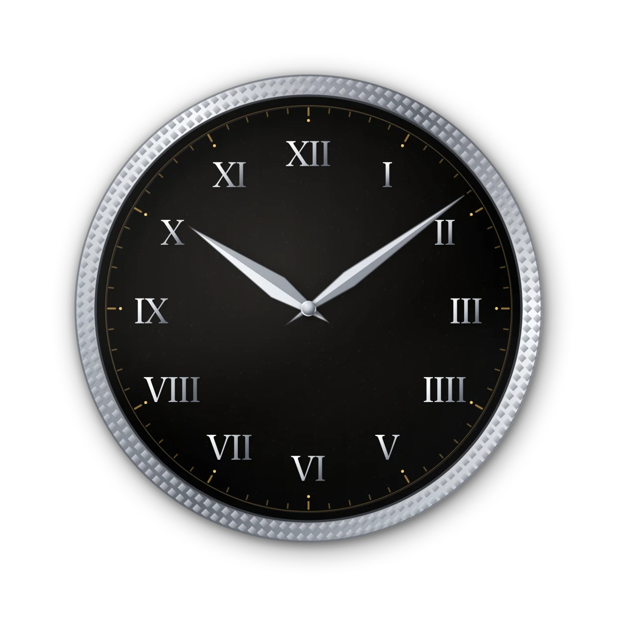
It balances the VIII opposite and divides the dial into three.
And in the Roman-numeral dial, four is written IIII, not IV. Watch and clock dials have used IIII almost without exception for centuries: it balances the VIII opposite it and divides the dial into three equal zones. I had IV. It is the sort of detail that costs nothing to get right and everything to get wrong, because the people most likely to enjoy this are precisely the people who will see it immediately.
There is no seconds hand
Deliberately. A Home Screen widget's timeline carries one entry per minute, so a seconds hand would sit visibly frozen — and a watch with a stopped hand does not read as a stylistic choice, it reads as broken. So every collection here is one that works honestly with two hands. That is also why there is no chronograph: a chronograph dial is built around sub-dials that a running seconds hand drives, and without it they are three dead circles.
Removing a feature to keep a thing honest turns out to be most of what this project has been.
The watch faces described here are drawn in SwiftUI in an iOS widget app called Atelier Watch. Nothing in it copies any maker's protected design — the vocabulary of these categories is shared, and that is what is drawn.